Translating complex ideas into brands & websites people love.
Two Studio works with high-value businesses to turn complex or under-communicated value into clear, premium brands and websites people understand, trust and love.
We started as two designers with a simple idea: companies with real value should look like it. Clear, credible and built to perform.
Today, we work as a boutique studio across 10+ industries, taking on complex, high-impact projects and bringing in the right talent when needed without the overhead of a traditional agency.
Two is still who we are. Close. Hands-on. Beyond what’s expected.

Egor

Aslan
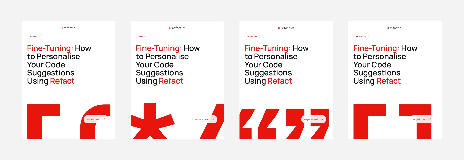
Refact.ai: Branding that ditches the clichés of the AI industry

Challenge
Refact.ai is a startup that’s changing the status quo when it comes to AI coding assistant tools.They came to us with a request to create a visual identity that was as unique as their approach.
Outcome
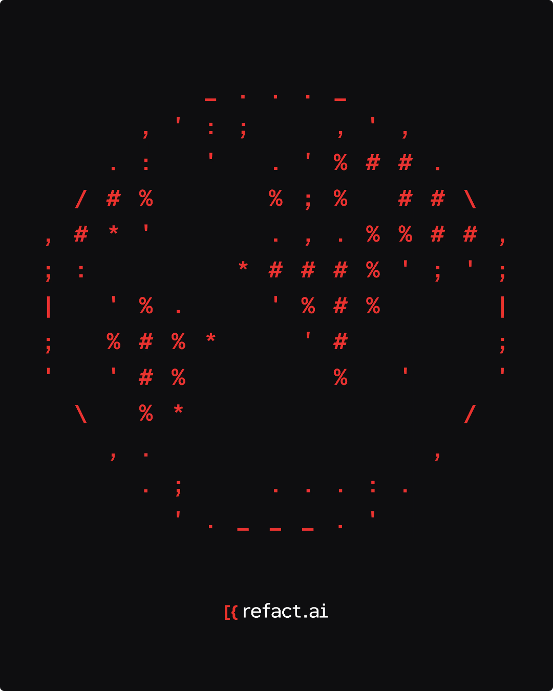
We’ve ditched the purple gradients, neons and other AI clichés. Instead going back to basics by highlighting the beauty of symbols and characters that showcase the efficiency of refact.ai, but also add a sense of geekiness and playfulness.

Concept developement
Despite how exciting AI is, we discovered that the visual landscape of AI products is very repetitive. The general tendency is to stick to cold gradients, neon elements and dark mode. We knew we had to do something different.
We had two main considerations when developing the concept, firstly we wanted to highlight the simplicity and efficiency of refact.ai. Secondly, we wanted to show the open-souce and human aspect.
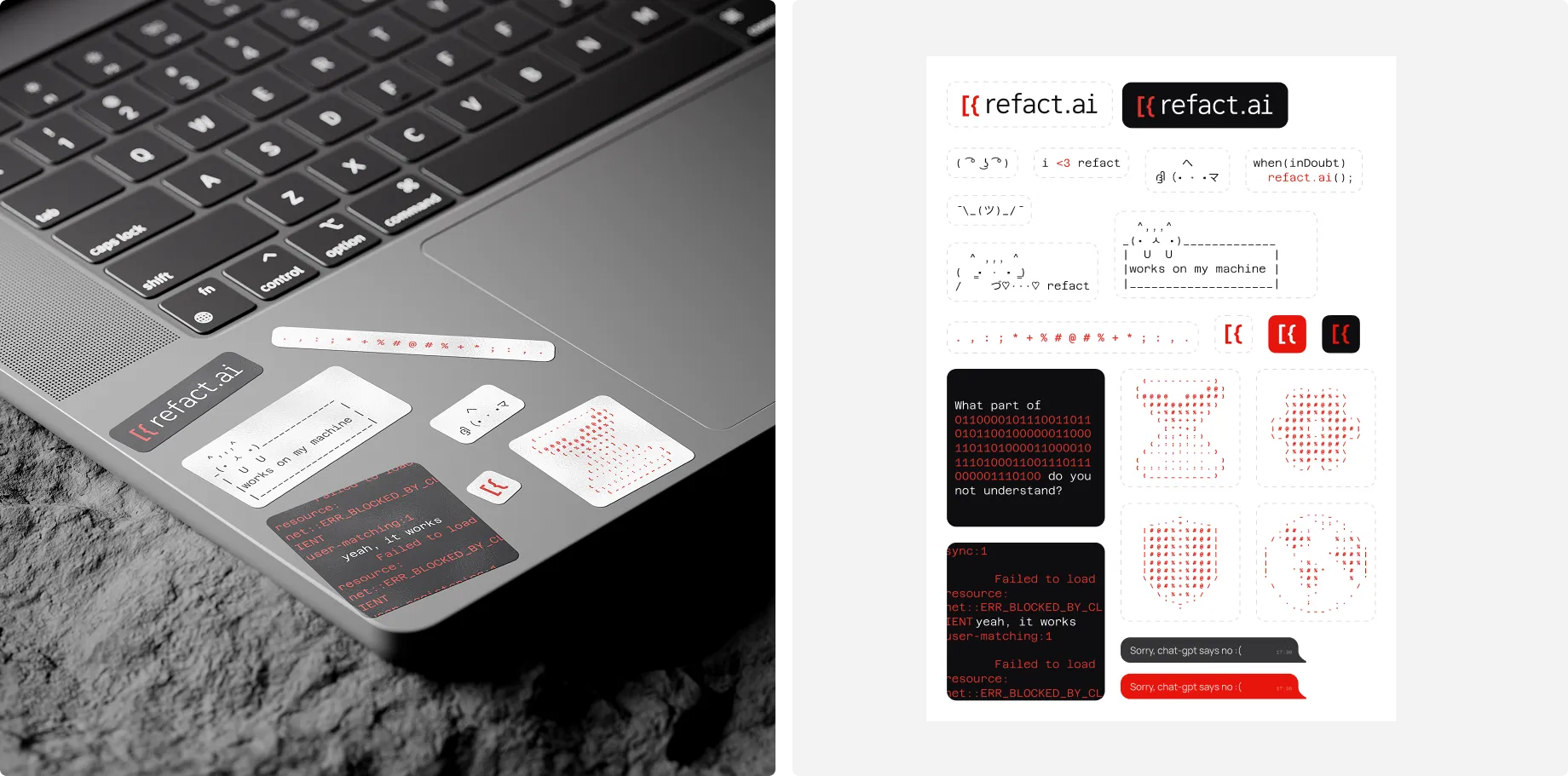
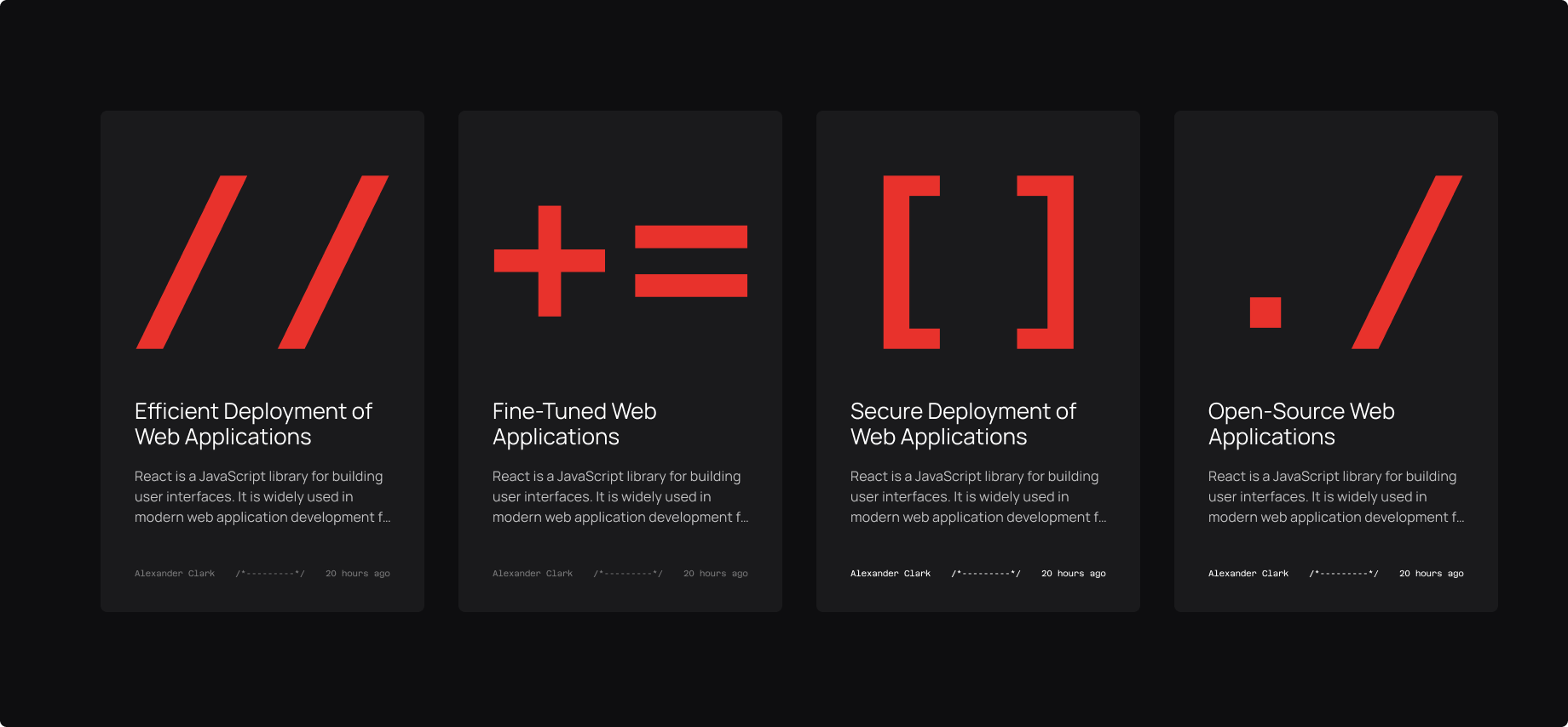
Key elements
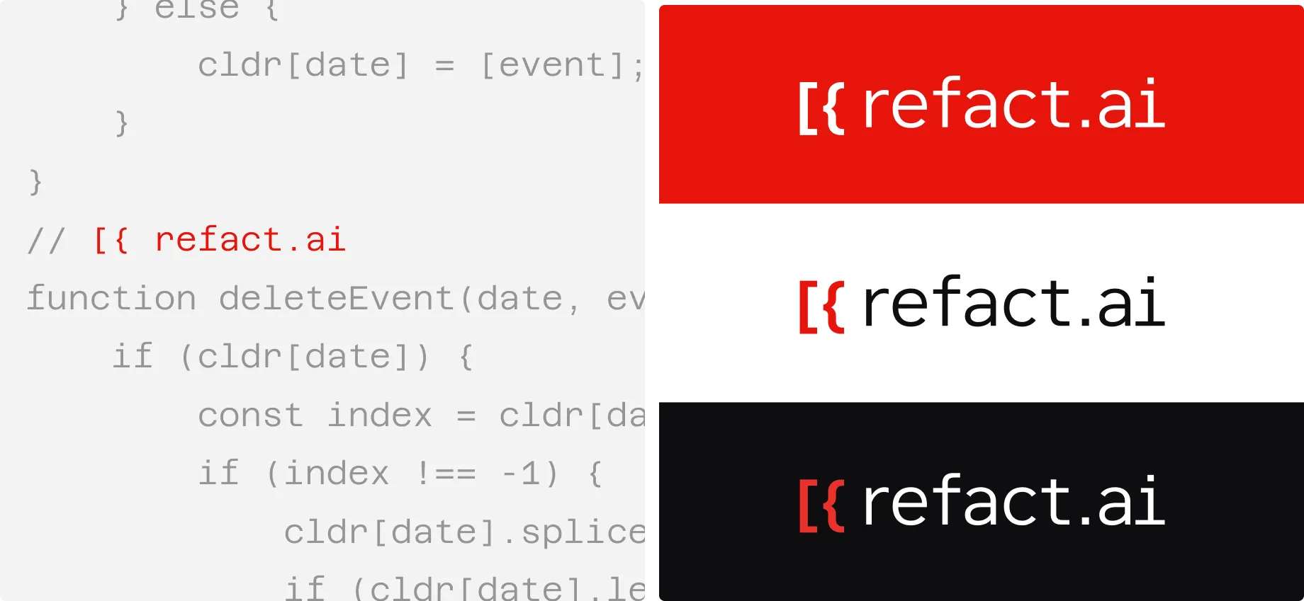
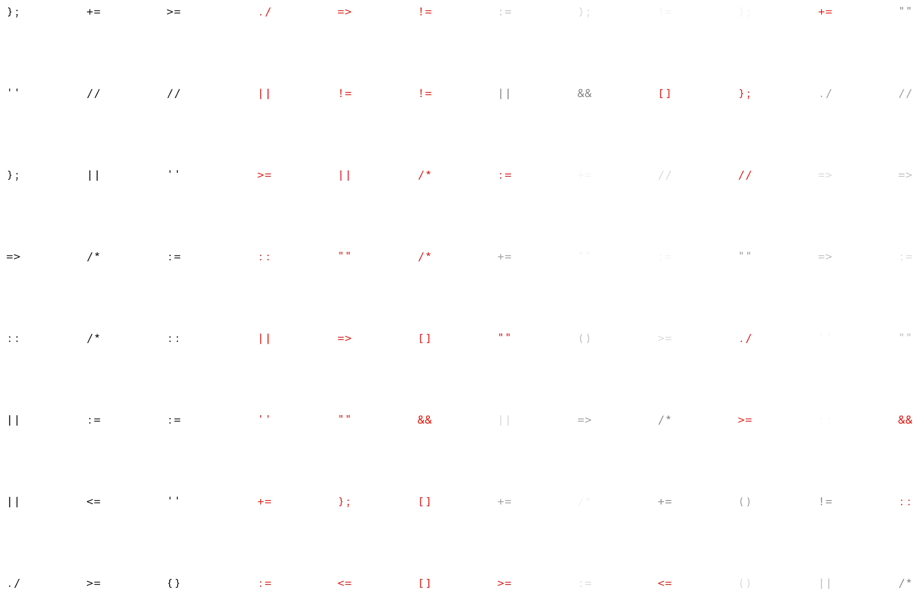
The centrepiece of our concept are symbols or characters, specifically a combination of 2 symbols that together refer to different concepts in programming. This approach not only highlights how efficient refact.ai is but also allowed us to introduce ASCII art into the branding which added playfulness and a sense of geekiness.
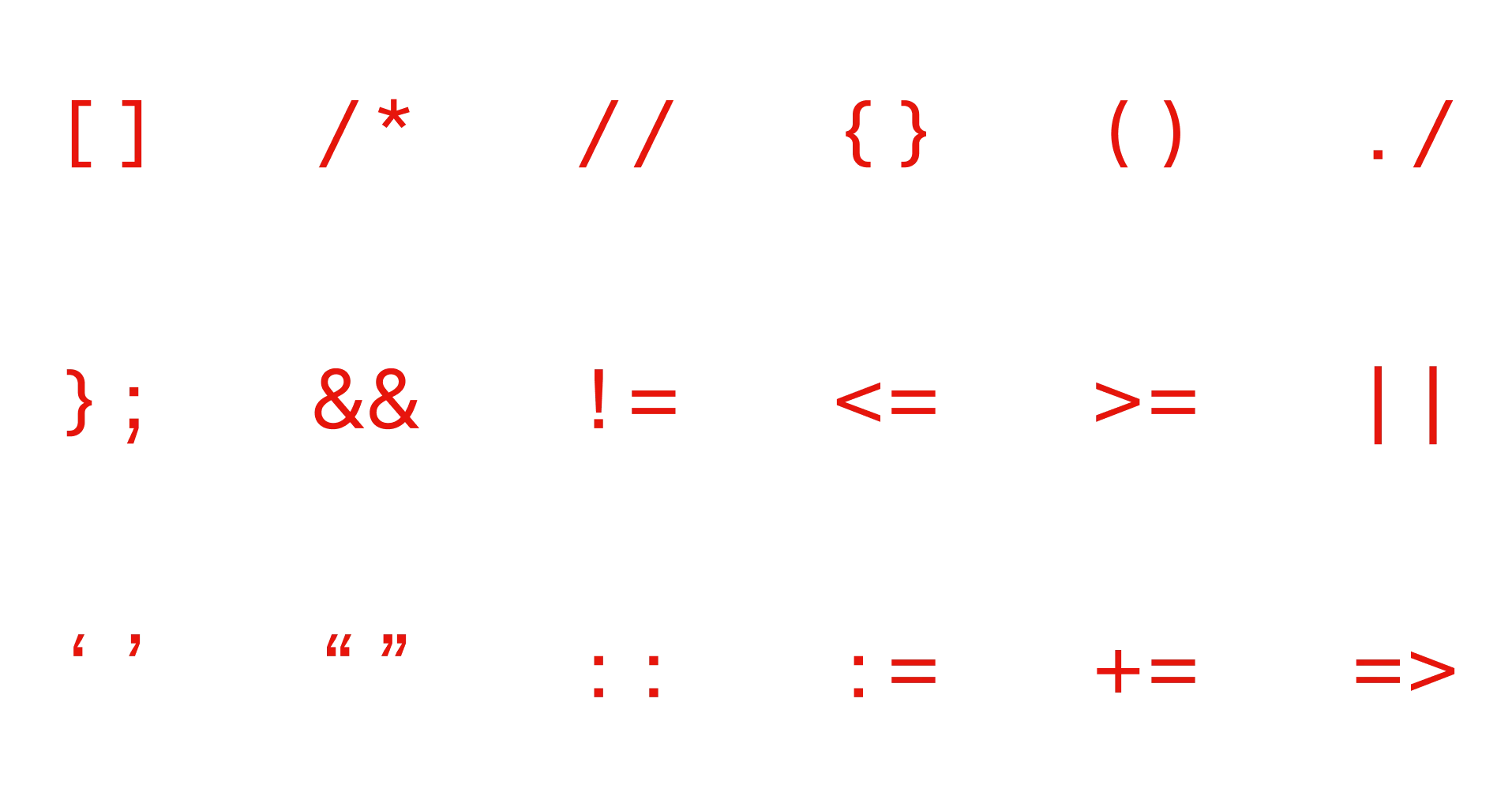
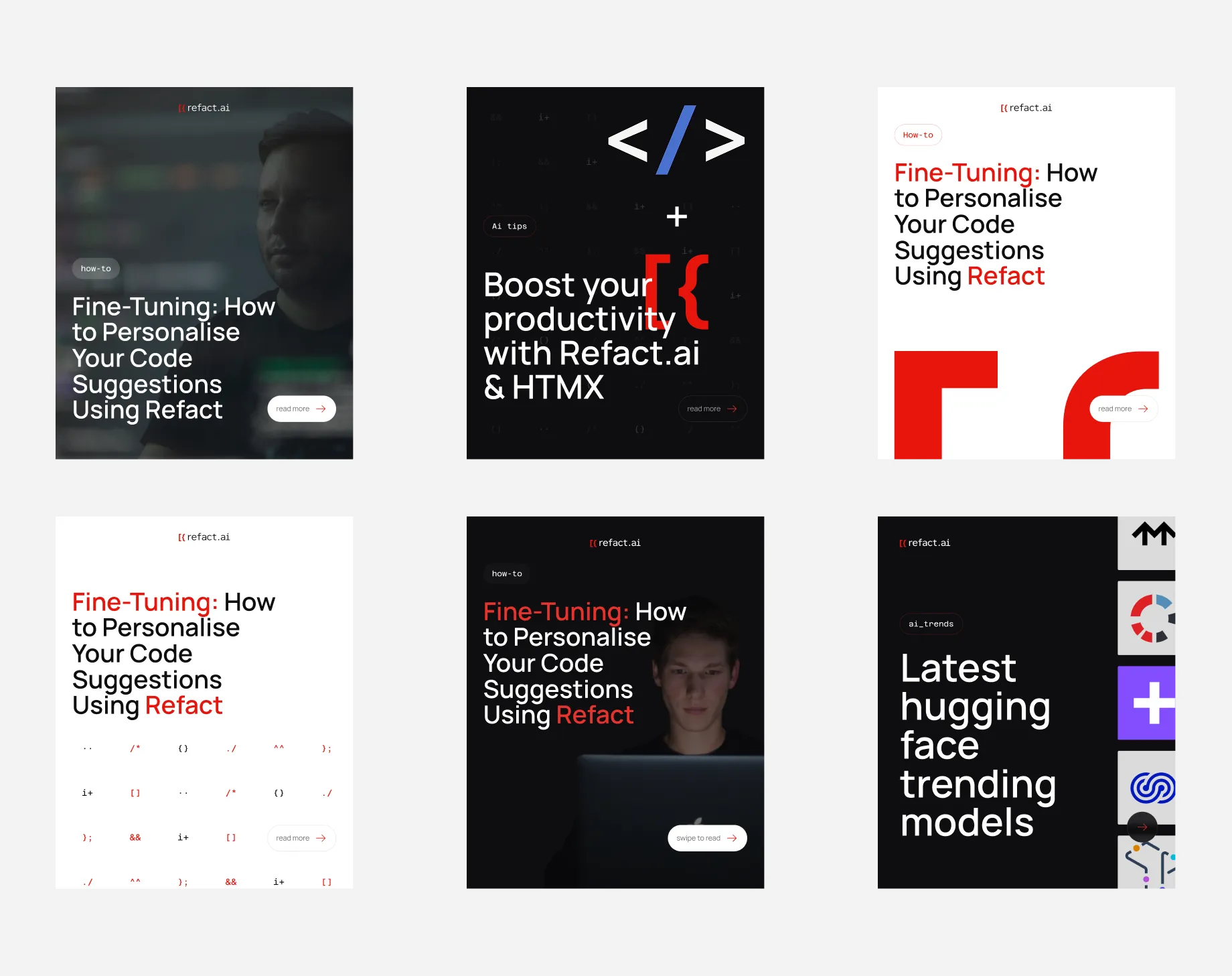
Patterns
By randomly picking symbols and putting them in a grid layout we created various patterns to use as backgrounds or stand alone graphic elements.
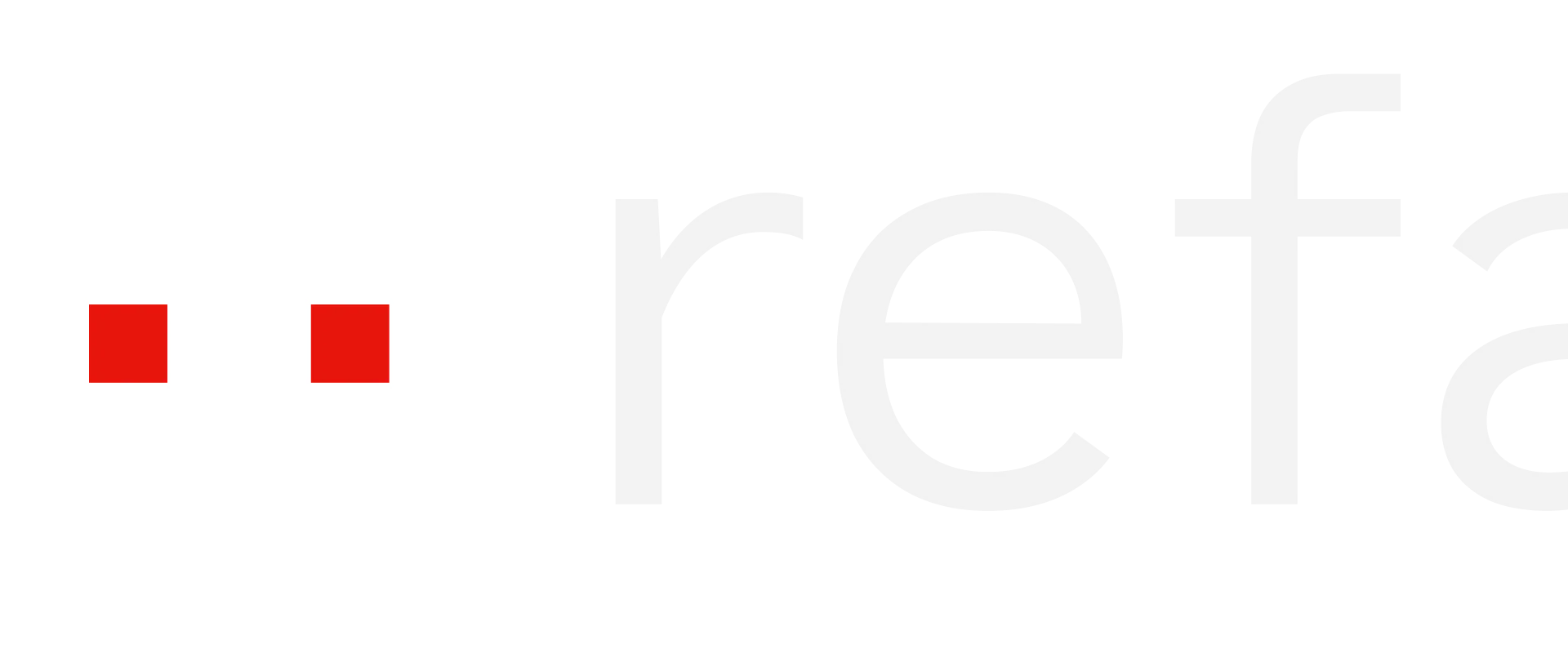
Mascot
Our mascot is also built of symbols, the 2 middle dots specifically. When used in static it can be seen as part of the code, however in motion it turns into a buddy who can help you in the IDE, guide you or just hang around while you work. It never disturbs or distracts you from work, it is there when you need it.
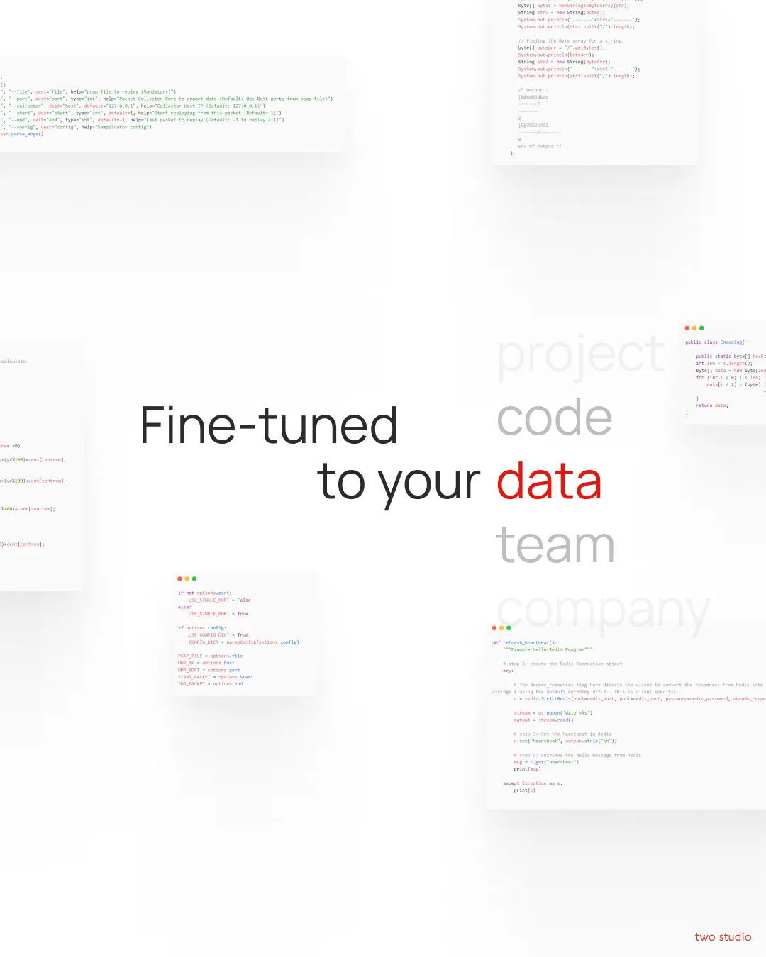
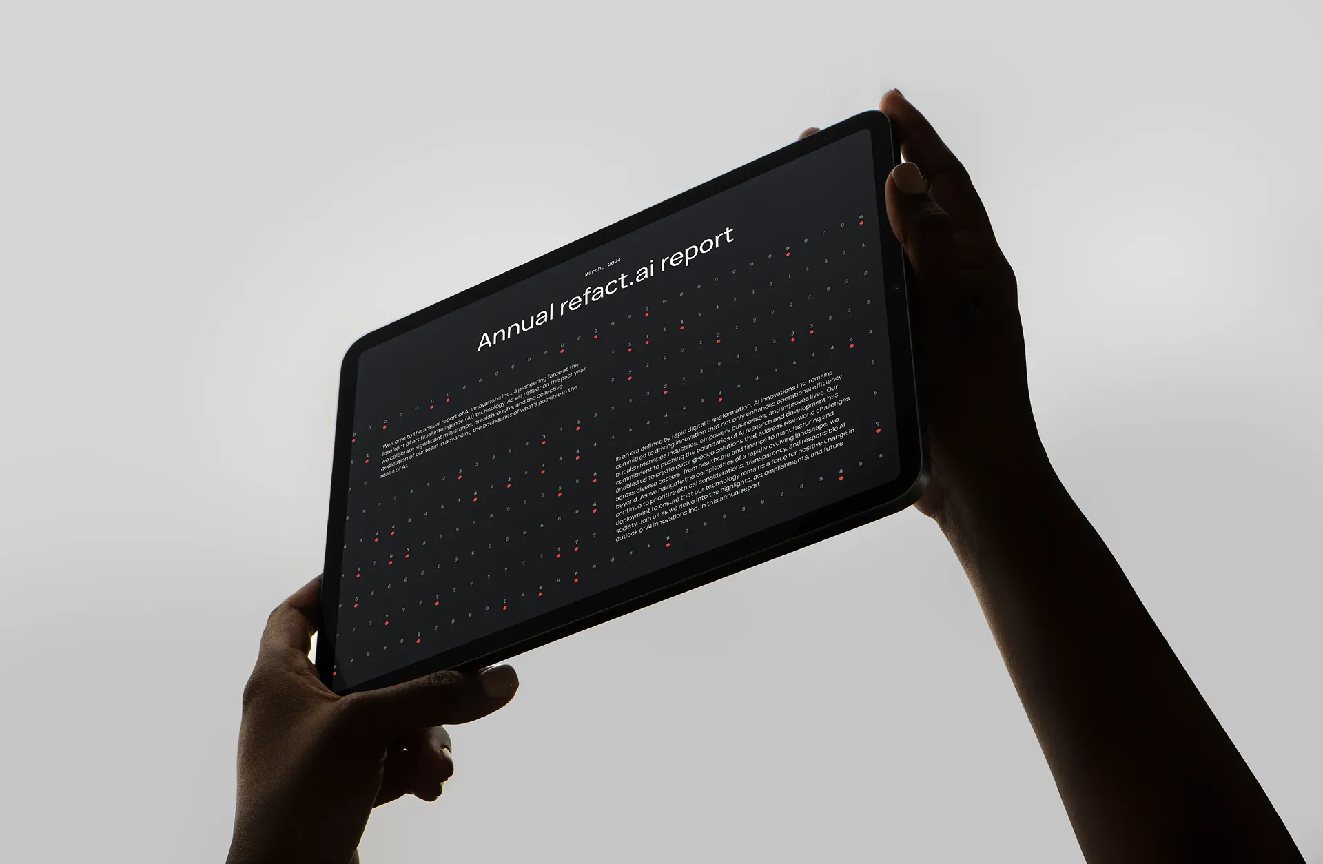
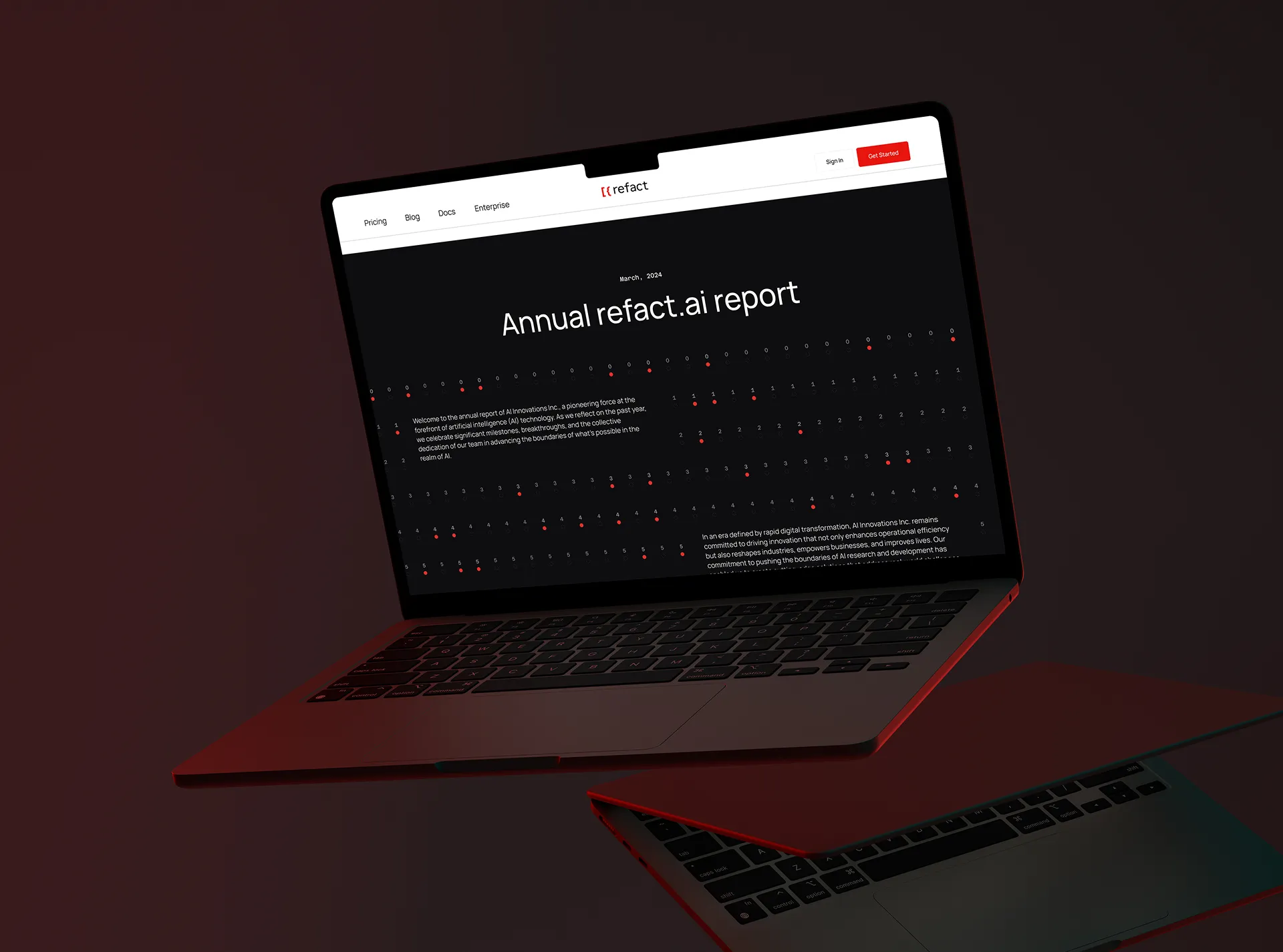
Website
The main consideration for the website was to keep it usable and familiar, but also find opportunities to add more personality to it which we achieved by using patterns as background elements, and taking advantage of the hero section on the homepage to make a memorable impression on the visitors.
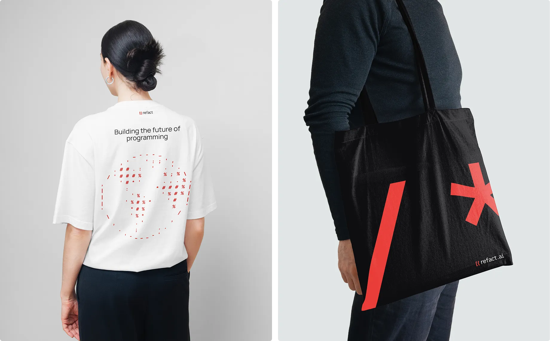
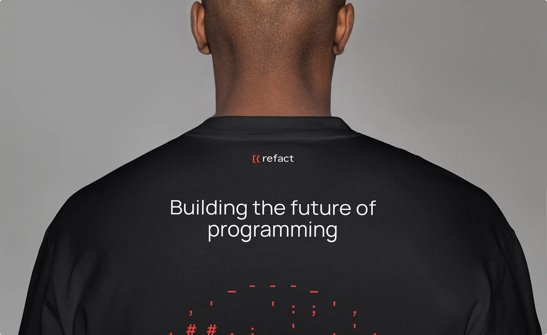
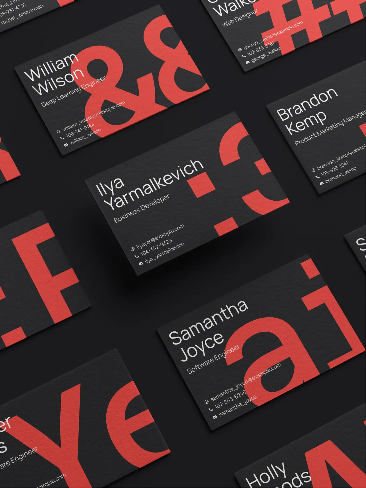
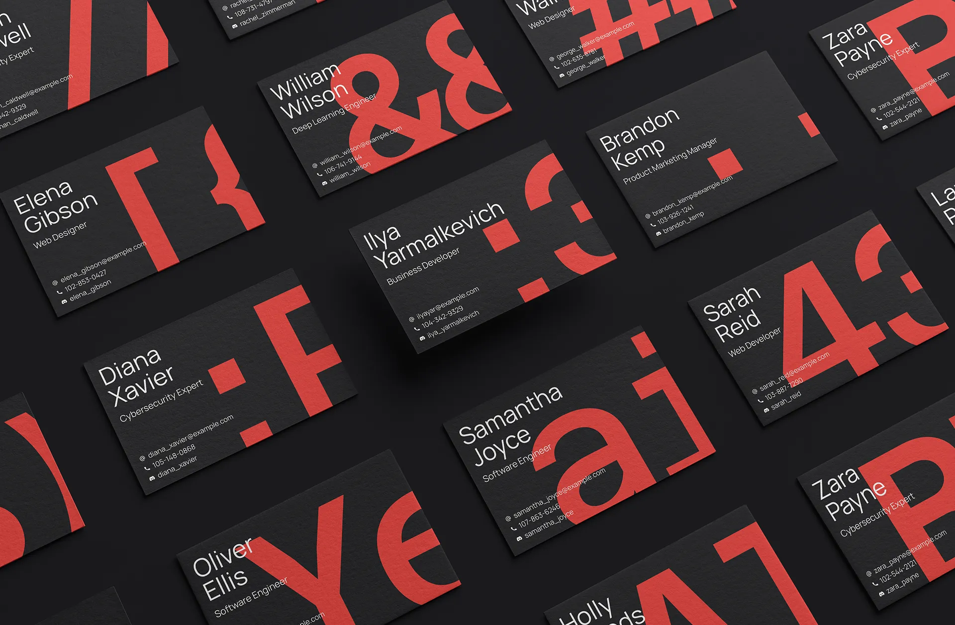
Merch & Swag
As part of our ongoing partnership with refact we have designed several pieces of merchandise for the team to represent refact.ai at various conferences at events.