


SeeMe is a community and a platform that helps ambitious women through lived experience coaching and learning resources. Our mission was to take SeeMe from the idea stage to a fleshed out product.
We helped SeeMe define their product offering, and created a brand strategy along with a killer visual identity. In addition, we have designed and built their website.
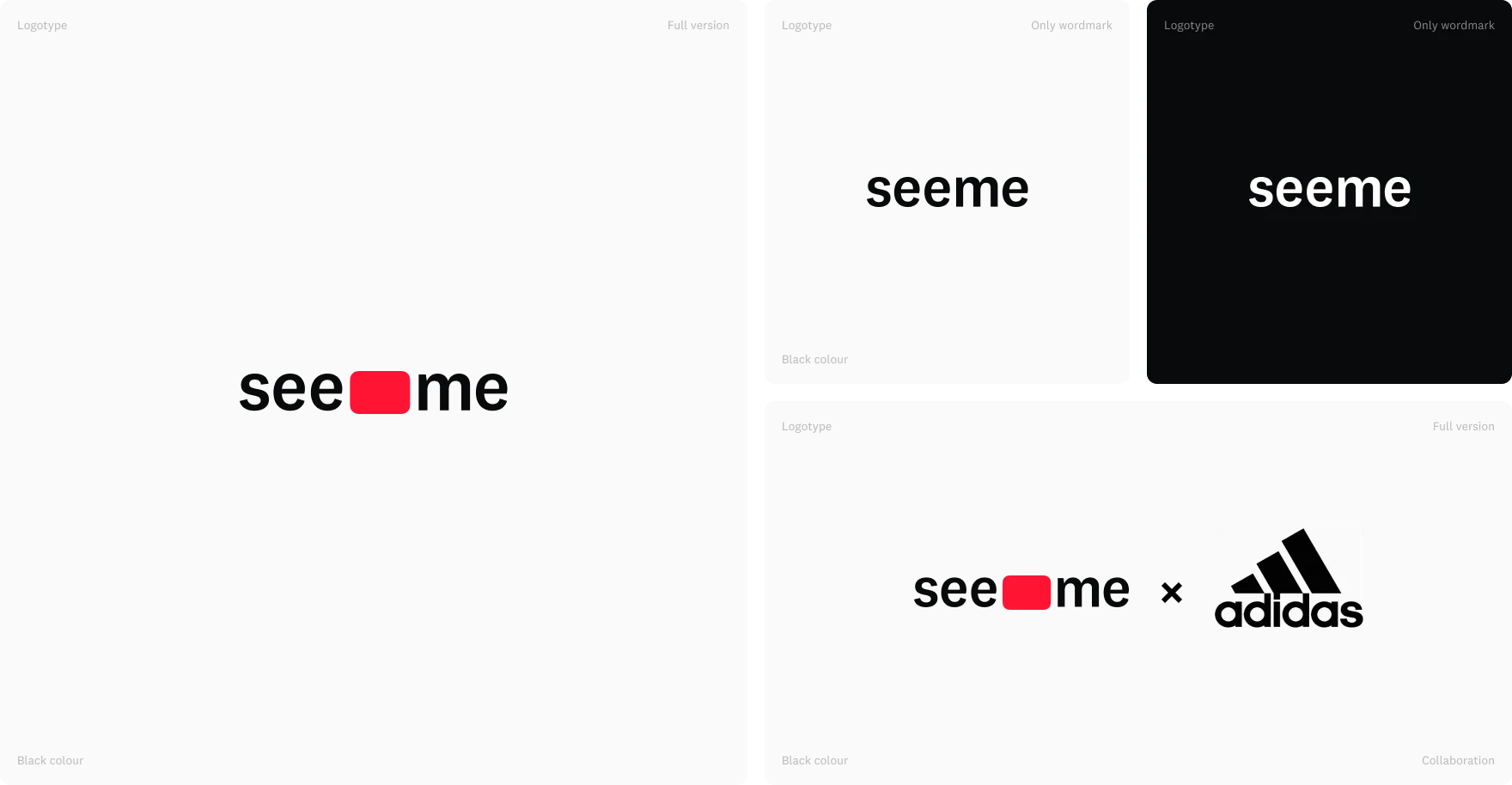
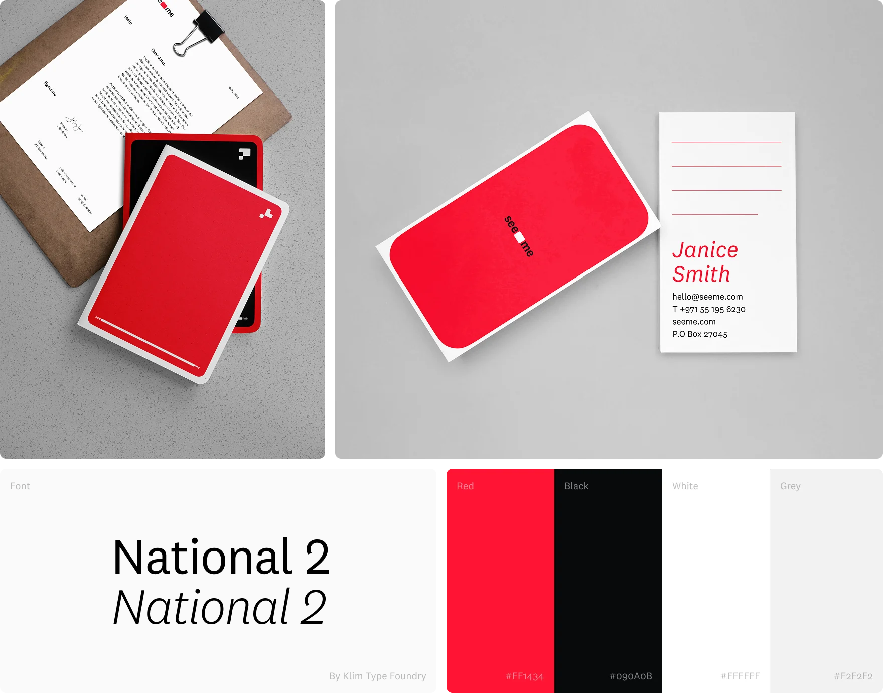
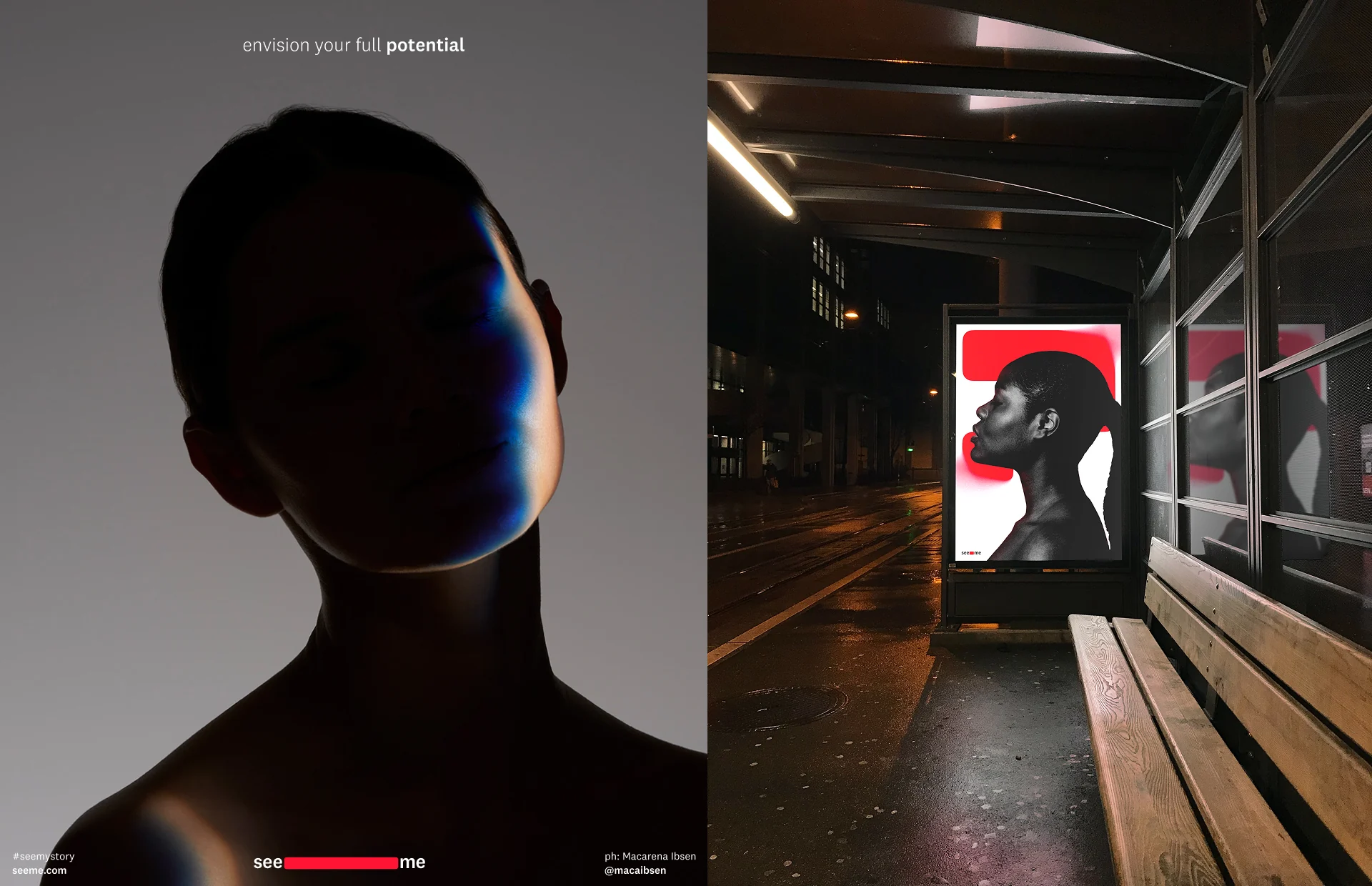
SeeMe’s brand identity is based on the idea of revealing something previously invisible or hidden. The red rectangle shrinks and stretches out which works as a metaphor of revealing something that was hidden and calls to be seen, also representing personal growth and expansion which SeeMe community brings
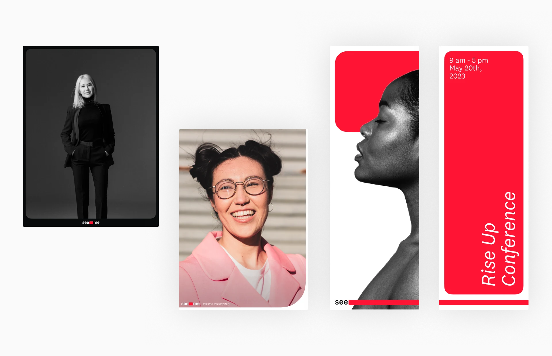
It’s not just a rectangle that we use as graphic elements. What makes the identity is the curvature. It morphs, expands and reveals.
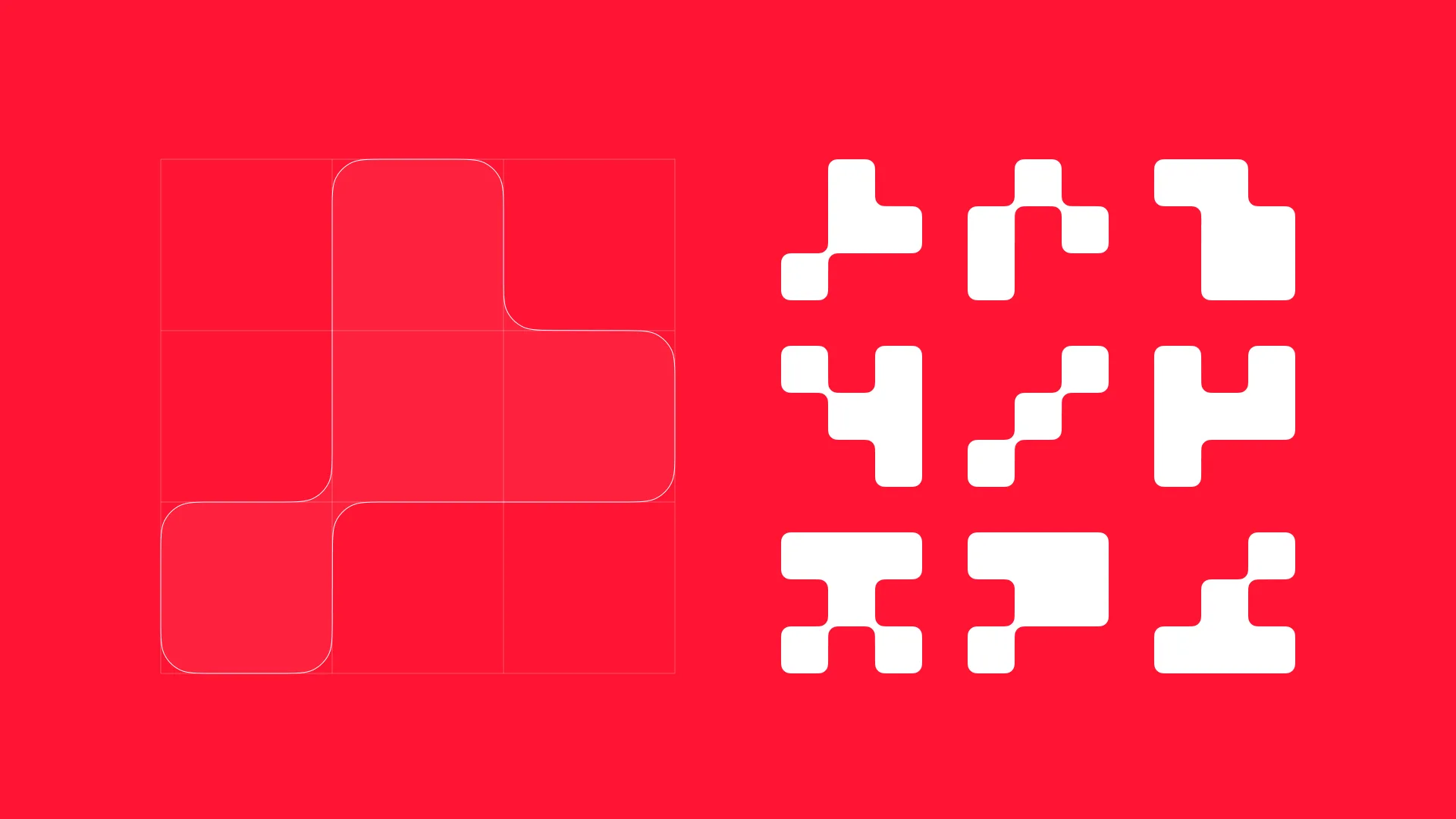
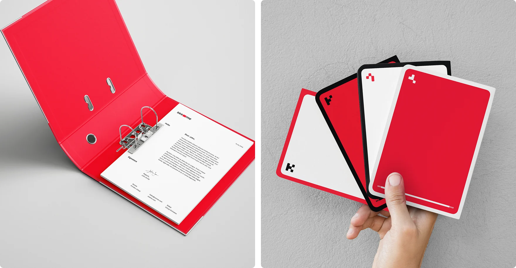
That’s why we’ve come up with a simple pattern generation based on a random 3x3 grid of squares with applied seeme styling. We call it "glyph".

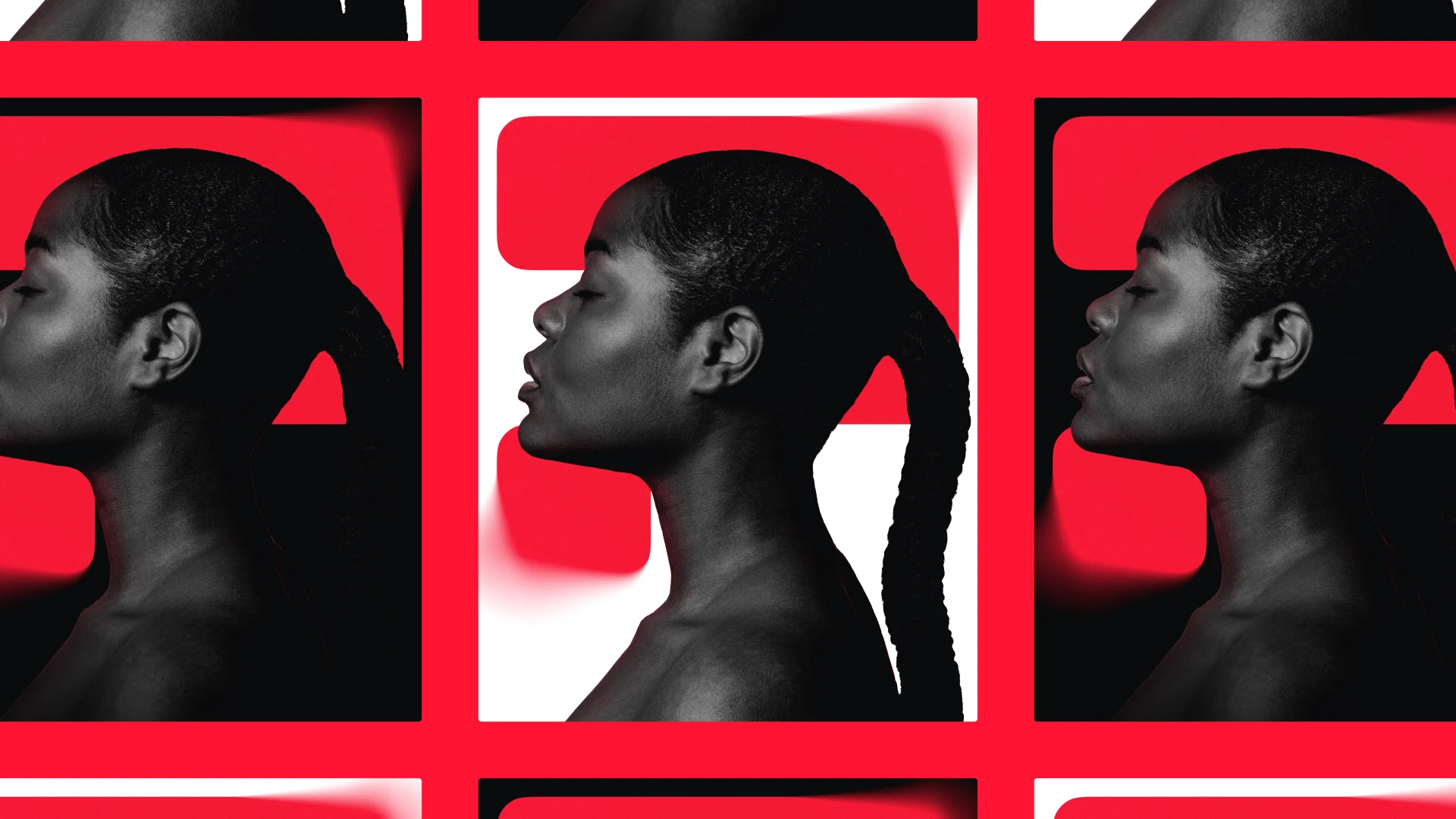
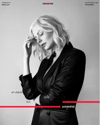
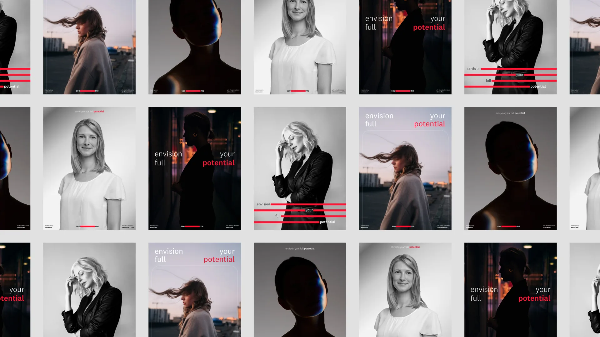
Envision your whole self is a powerful reminder that what we see is often limited by our own experiences and perceptions. By exposing ourselves to new stories and perspectives, we can expand our vision and open ourselves up to new possibilities.
Through Seeme, we aim to provide a platform where ambitious women can see themselves in the stories and experiences of others, and be inspired to pursue their own dreams and goals.
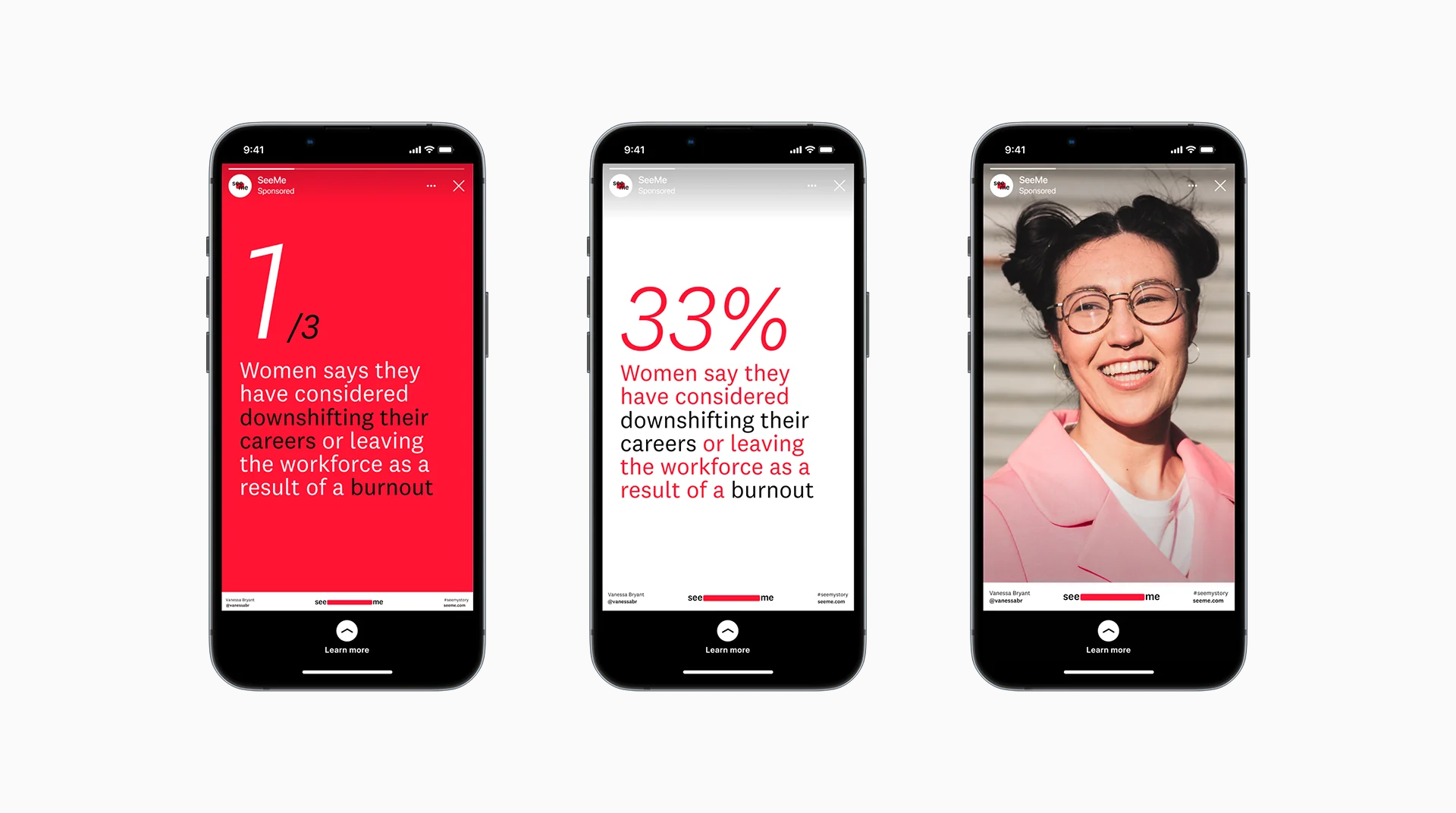
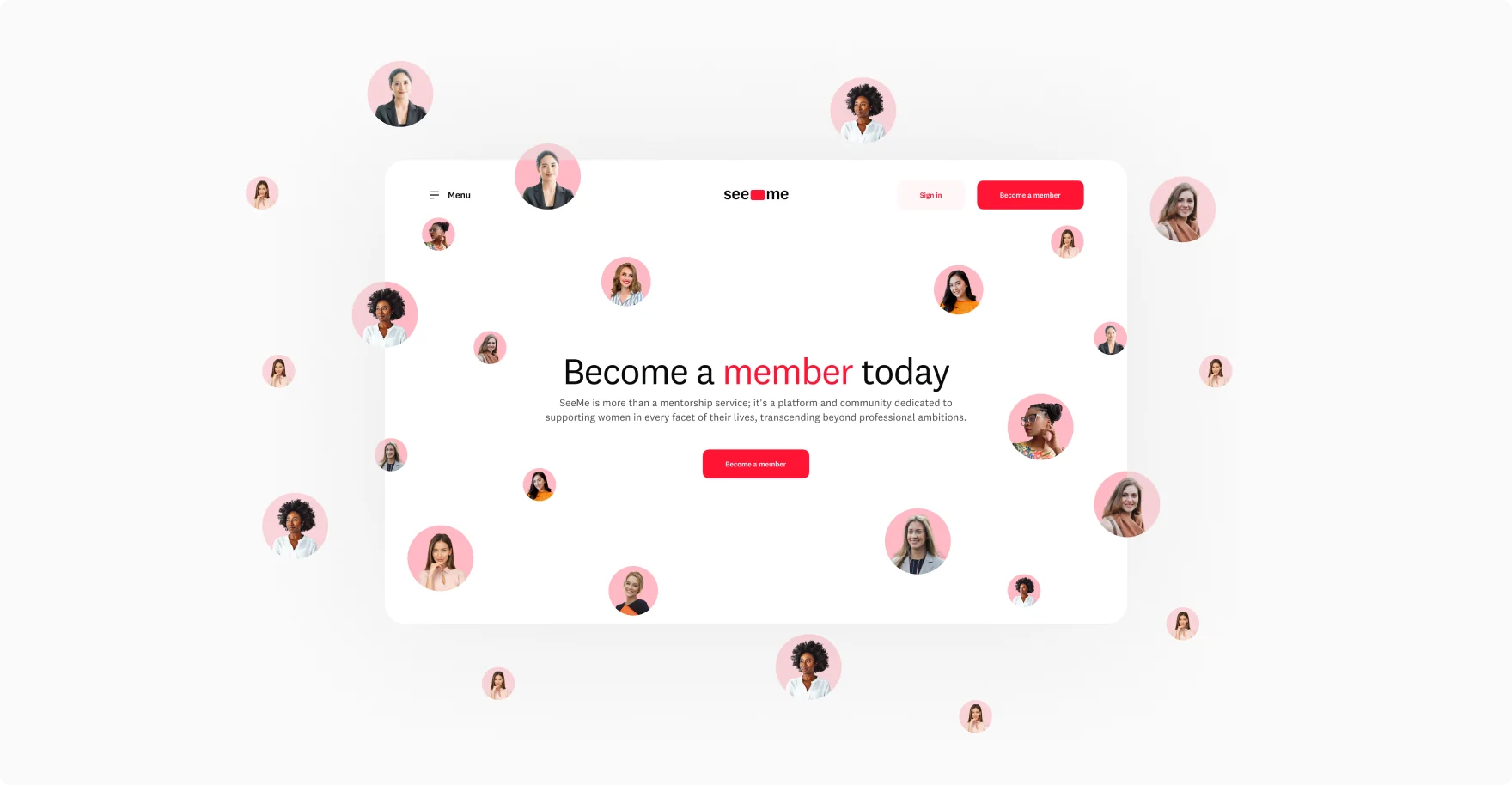
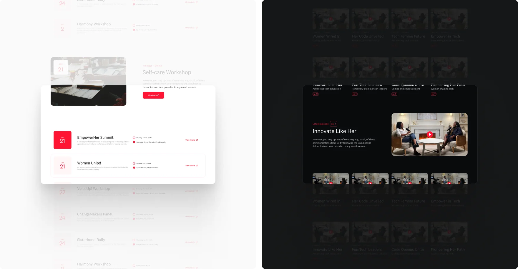
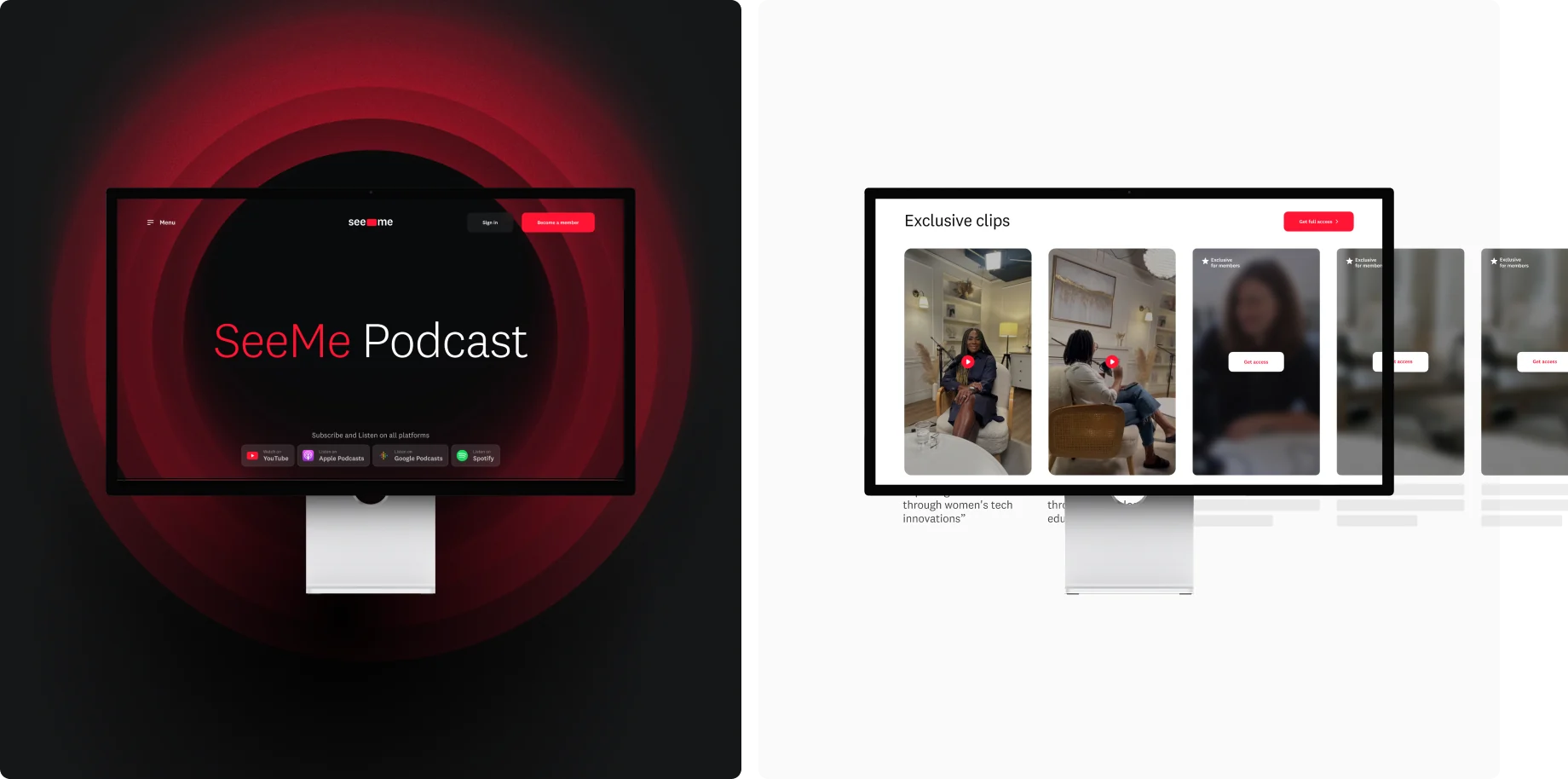
SeeMe’s website is a place to learn more about the brand’s vision and story, but it also acts as a comprehensive content hub, featuring their podcast, marketing masterclasses, and membership platform. Our main challenge was to encapsulate both of these elements in an elegant package that’s easy to navigate and use.
“If I could download my brain into a tangible form and visualise it, without a doubt, the result would be what Twostu created for SeeMe. The way they seamlessly translated what was in my thoughts into a cohesive and visually stunning brand is nothing short of magic.”